Hear For You
Inspired by my desire to support victims of discrimination and to advocate the impact of community-based solutions.
Role:
UX Designer, Project Manager
Figma, FigJam, Webflow
Length:
2 weeks, July 2022
Tools:
UC Davis Final Project
Purpose:
3 UX Designers
Team:
Skills:
Product Roadmapping, User Research, Wireframing, Prototyping, Interface Design
Understanding the Problem
Qualitative Research
What is discrimination and do people experience discrimination differently?
I conducted 3 user interviews through Zoom (duration of 30 minutes).
Asked 11 different questions about their experiences with discrimination.
What I wanted to learn & goals for the interviews:
To understand what people view as “discrimination” and compare it to textbook definition.
To collect people’s own experience with discrimination.
To learn how we can help users feel safer and how to be proactive in taking action when a hate incident occurs.
Q1. What is your definition of discrimination?
According to our interviewees, discrimination can be described as “anything meant to inflict harm” or “hateful and judgmental behavior” towards a specific group(s) of people.
Q2. Have you experienced or witnessed discrimination in public?
While only one of our interviewee experienced direct discrimination in public, all of our interviewees have witnessed someone else experience discrimination in public.
Q3. What can be done to prevent discrimination?
Most interviewees expressed the importance of educating others about different identities. Some advocated for breaking down systems rooted in discrimination.
Qualitative Research
Interviews led to more questions:
How many people have experienced discrimination in public and how often do they experience it?
Where do instances of discrimination occur most often?
How many people have reported these incident(s)? And if not, why?
Decided to answer those questions through a survey study:
Anonymous Google form survey with 15 questions (included ranking, short and long answer questions).
Distributed via social media to close communities (convenience sampling).
Collected answers from 34 participants with diverse demographics.
73% of participants responded yes to experiencing or witnessing discrimination.
More than 50% of responders experience discrimination between a few occasionally to very often.
80% of responders say they experience or witness discrimination in public settings.
Building Empathy
Who is our user?
Enduring discrimination versus witnessing discrimination are two different experiences.
A victim of discrimination would benefit from a tool that helps them process the traumatic experience, while a witness of discrimination would need guidance on how to help the victim.
Because I wanted to provide direct aid to users following a discriminatory incident, I decided that our user persona will be someone who experiences discrimination.
Jasmine’s Journey Map
A journey map was drawn out to explore how Jasmine navigates her experience with discrimination and identify opportunities to address her pain points.
Exploring her experience allowed me to see which pain points impacts her the most and possible solutions to alleviate them.
It was at the end of her journey, where she had trouble processing her experience, where my help would make the most impact.
Problem Statement
People encountering discrimination and hate incidents want to advocate for themselves and report the incident but do not feel comfortable involving local authorities due to mistrust, tedious processes, and the anticipated stress of reliving traumatic moments.
Defining a Solution
Sticky Note Brainstorm
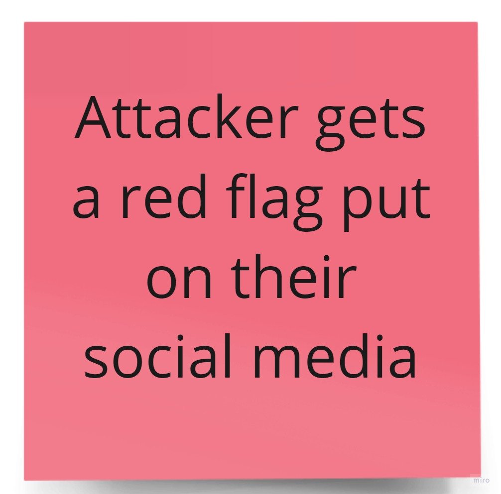
(Pink): This idea was left out because, though it holds the perpetrator accountable, it’s a solution that can lead to multi-faceted consequences.
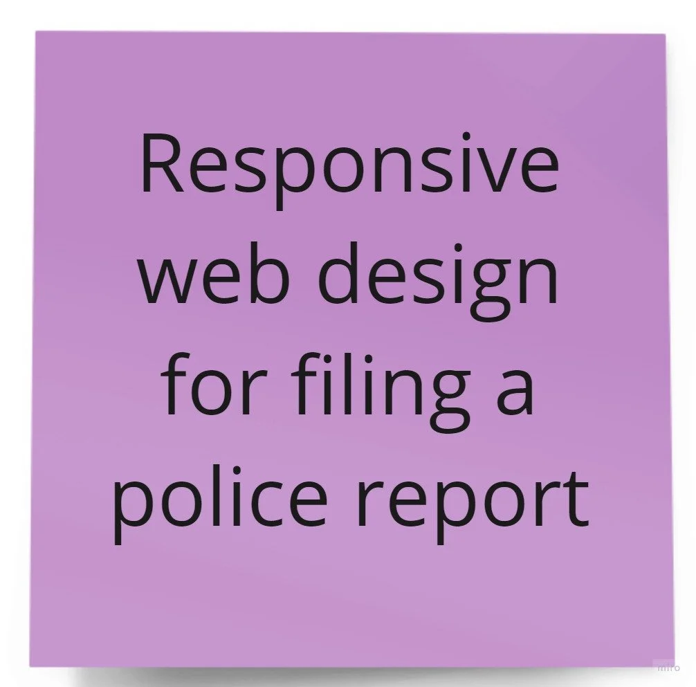
(Purple): I kept this idea because its purpose is to make reporting a hate incident easier for our users.
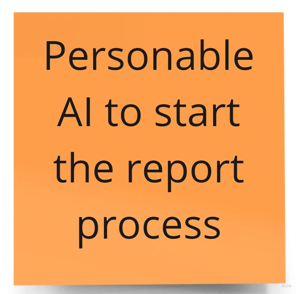
(Orange): I liked the idea of including an AI or machine learning API in our project, however I was concerned that it would take too much time to prototype and cause a potential roadblock in our 2-week project timeline.
Prioritization Matrix
Impact: My ability to interface with my users and help relieve their pain points.
High: Our users feel safe and is able to process the traumatic incident after using our prototype.
Low: Our users are frustrated and feel that nothing improved after using our prototype.
Complexity: The amount of time, effort, and ability to create the product as well as the involvement of any political, social, or economic infrastructure.
High: The most complex idea we had was including an API that involved AI, requiring a depth of engineering knowledge I lacked.
Low: Although easier, many of the low complexity ideas were also low impact.
Final Solution
A solution that allows our victim to choose what kind of support they need (user flow pictured left):
A main feature with an option to live call or text a counselor.
Pro: Users are connected with a counselor to receive immediate care.
Con: Users might be too scared to open up to a counselor.
A community platform to anonymously report incidences.
Pro: Users receive community support from people who have had similar experiences.
Con: Potential problems with maintaining anonymity as well as moderating platform to prevent inappropriate and derogatory posts.
Wireframing, Prototyping & Usability Tests
Paper Prototypes
Desktop or mobile app?
I wanted my prototype to be as accessible as possible.
Responsive web design was the best approach because users can access it both through their smartphone and computer.
Designing Mobile First
In 2025, over 70% of people will access the internet solely with their phones. Therefore, I designed my prototype mobile-first to provide the best experience for users.
Clickable Prototype
After adjusting my paper prototypes, I wireframed and developed mid-fidelity clickable prototypes so that I could conduct usability tests with some of our target users.
Usability Testing
Although I was only able to conduct 2 usability tests through video call, I was able to collect useful feedback on how my prototype can best serve my target users.
Style Tile
Color Choice:
I chose to use a teal color because, according to Pantone, it was said to be one of the most supportive and safest color.
Rounded Buttons:
To match the theme of being a safe and supportive platform, I chose to use buttons with rounded ends to give the product a softer look.
Typography:
I wanted our users to be able to easily read and follow instructions on how to use the product. So, I chose to use a sans serif font with only two variations of sizes.
Graphics:
To avoid any distractions, I searched for illustrations that were 2D and basic in color. (Graphics taken from unDraw)
Final Prototype & Conclusions
Lessons Learned
Time management = juggling tradeoffs
There were so many features my team wanted to create, but with only a 2-week window, as the project manager, I had to decide what to focus on and what to sacrifice.Constant communication and documentation is key to project success.
I am grateful that in my final project I was able to sharpen my project management skills. I was able to practice formulating product roadmaps, delegating tasks, and making sure my team met outlined deliverables.
Try It Out!
Test out my prototype.
Link to Figma prototype.
Check out my Webflow site.
Link to website.
Want to work together?
Connect with me at samanthachen954@gmail.com


